
Bubbleのチェックボックスを使うときに、条件によってチェックとチェックしていないを切り換えたいと思ったことはありませんか?
Bubbleのチェックボックスは手動でチェックする分には問題なく機能するのですが、データベースの情報を元にチェック、アンチェックを切り換えるのは苦手だったりします。

自分もこのチェックボックスに苦しめられていましたが、ImageElementとCustomStateを組み合わせることで、疑似的なチェックボックスを作ってしまえばいいのでは!という考えに至りました。
チェックボックスの状態表示に悩まれている方は、こちらの記事を参考にしてみてください。
前提条件
前提条件
- Bubbleの触り方がなんとなくわかる
- CustomState を触ったことがる
この章で学べること
この章で学べること
- チェックボックスの作り方
- 条件追加によるチェックボックスの制御方法
- CustomState の使い方
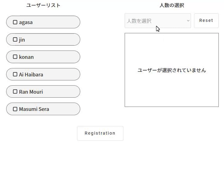
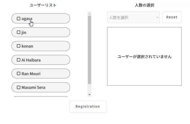
作るもの
機能一覧
- DropDownにて人数を選択
- ユーザーリストから追加したいユーザーを選択
- 選択したユーザーは右側の枠内に表示
- 枠内の×ボタンを押すことで、非選択に戻す
- 指定した人数と選択した人数が同等になった場合、ユーザーリストボタン非活性
- Resetボタンにて選択人数と選択ユーザー削除
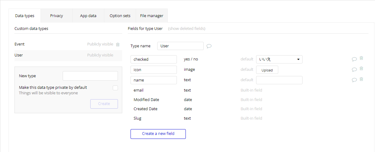
データベース設計
元々設計されているUserデータベースに以下の項目を追加
- checked = yes/no (default:No)
- icon = image
- name = text
ユーザーリストの作成
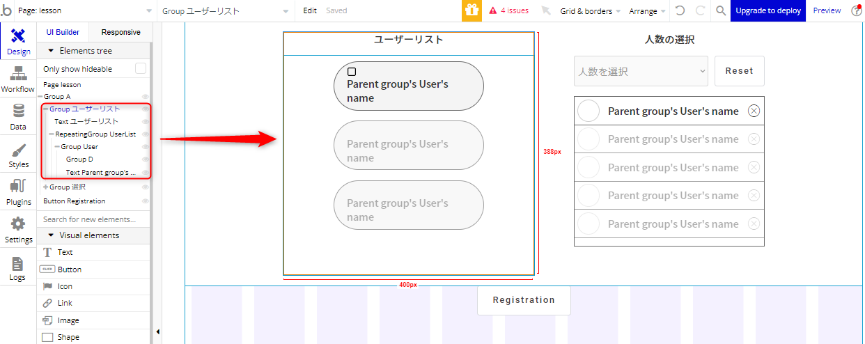
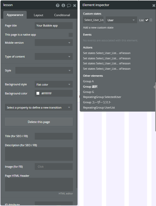
まずはユーザーの一覧を表示するGroupを作成していきます。
階層構造は画像を参照ください。
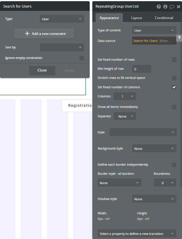
RepeatingGroupの作成
Appearance
- Type of content = User
- Data source = Search for Users
Layout
- container layout = Row
セレクトボックスの作成
自作のセレクトボックスを作成していきます。
予め、四角の素材と、チェックしている素材を用意してください。
無ければBubbleのアイコンでもOKです。
メモ
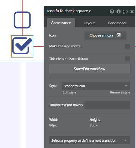
Icon name
Icon fa fa-square-o
Icon fa fa-check-square-o
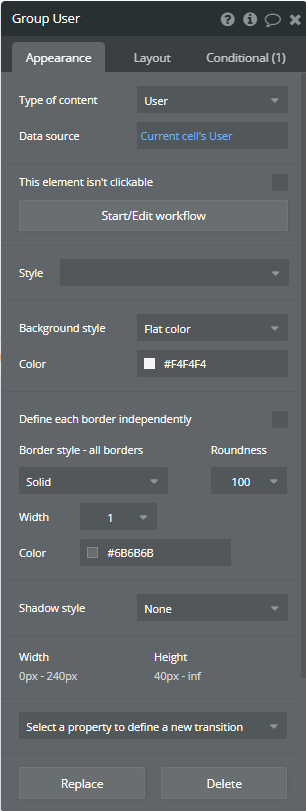
RepeatingGroup内にGroupを追加
Appearance
- Type of content = User
- Data source = Current cells User
- Border style - all borders = Solid
- Roundness = 100
Layout
- container layout = Row
- Apply gap spacing between elements = check
- Column gap = 4
- Max width = 240
- Min height = 40
- Margin = all 8px
- Padding(top,bottom) = 8px
- Padding(left,right) = 20px

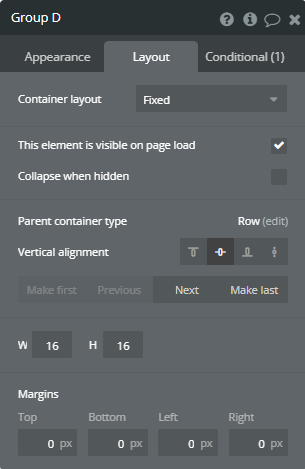
作成したGroup内に画像とTextを追加
画像は16px × 16px
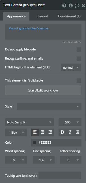
Textは16pxのNoto Sans JP(500 medium)を選択
Appearance
- Parent group's User's name
- Noto Sans Jp
- 500(medium)
- 16px
- color = #333333
人数選択Groupの作成
選択したユーザーを表示するGroupを作成します。
選択されたユーザーを保存するCustomStateの作成
一番親のページを選択し、iマークからCustomStateを作成します。
名前はSelect_User_List、TypeはUserを選択し、Listにチェックを入れます。
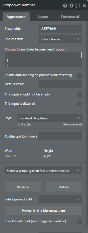
DropDownの配置
人数選択用のDropDown作成します。
Appearance
- Placeholder = 人数を選択
- Choices style = Static choices
- Choices = 0~9
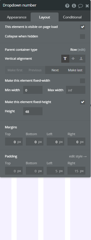
Layout
- Height = 48px
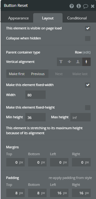
リセットボタンの作成
Layout
- Width = 80px
- Min height = 36px
- Padding(top, buttom) = 8px
- Padding(left, right) = 16px
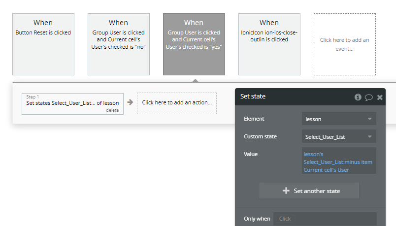
Start/Edit workflowからリセット動作を作成
CustomState内の情報とGroup内の情報(DropDown選択値)をリセットします。
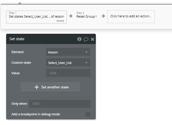
Step1
- Element Actions -> Set state
- Element = lesson
- Custom state = Select_User_List
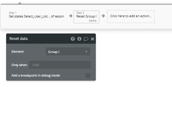
Step2
- Reset Group I -> DropDownとResetボタンがを格納しているGroup
選択されたユーザーの表示
選択されたUserを先ほど作成したCustomStateに一時保存し、表示するRepeatingGroupを作成します。
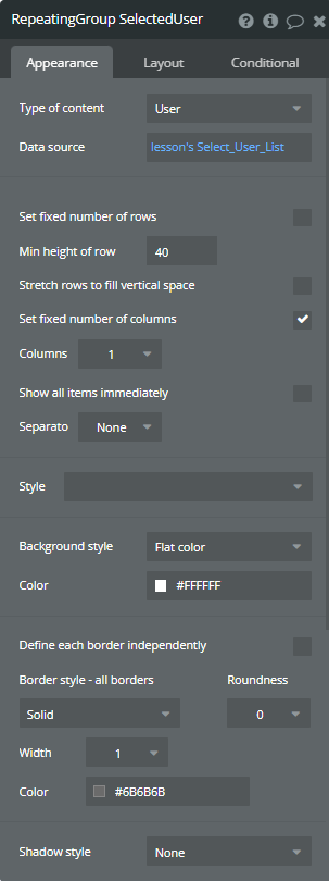
RepeatingGroupの作成
Appearance
- Type of content = User
- Data source = CustomState
- Min height of row = 40
- Separato = None
Layout
- container layout = Row

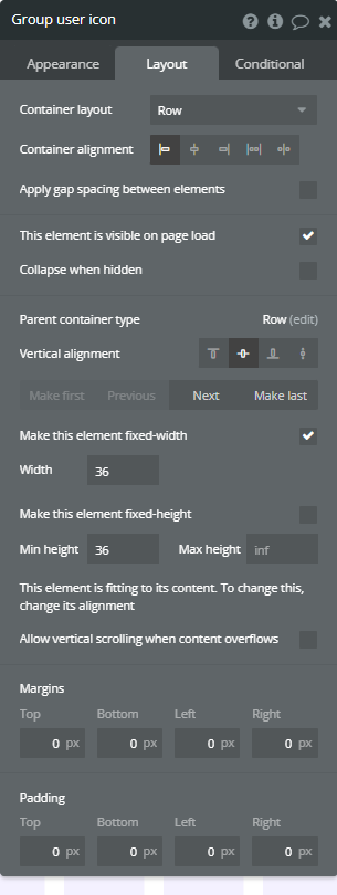
UserIconの設置
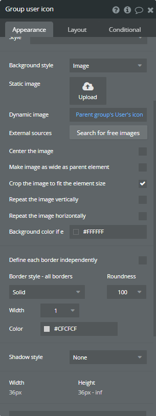
RepeatingGroup内にGroupを配置
Appearance
- Background style = Image
- Dynamic image = Parent group's User's icon
- Crop the image to fit the element size = check
- Border = Solid
- Roundness = 100
Layout
- container layout = Row
- Width = 36
- Min height = 36
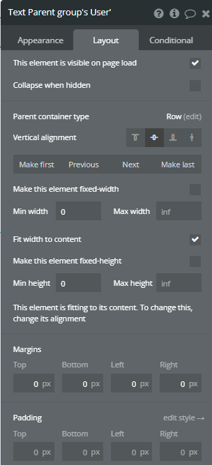
UserNameの設置
RepeatingGroup内にTextを設置
Appearance
- Parent group's User's name
Layout
- Fit width to content = check
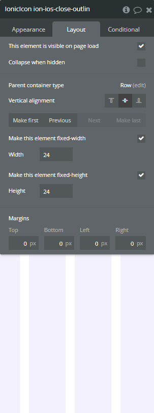
Close Iconの設置
RepeatingGroup内にIconを設置
Appearance
- Icon = close
- Icon color = #373737
Layout
- Width = 24
- Min height = 24

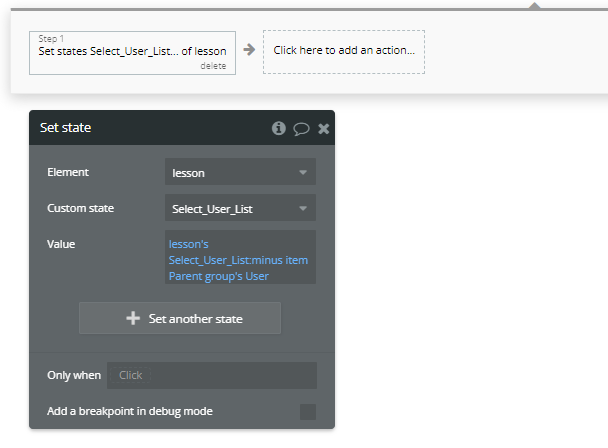
CustomStateのUserListから削除する動きを追加
Step1
- Element action -> set state
- Element = lesson
- Custom state = Select_User_List
- Value = lesson's Select_User_List:minus item parent group's User
※CustomState内のUserListからParentUserをminus itemで削除しています。
UserをCustomStateに追加
セレクトボックスに動きを追加
Group UserのStart/Edit WorkFlowを選択
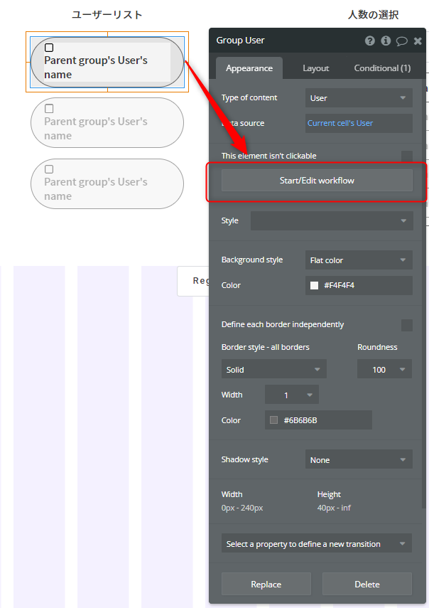
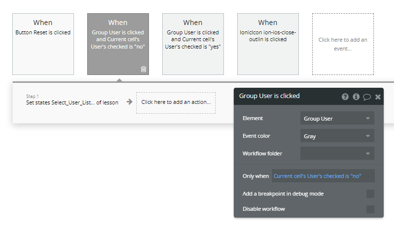
まずはチェックされていない場合の動作を作ります。
Group User is clicked
- Element action -> set state
- Element = Group User
- Only when = Current cell's User's checked is "no"
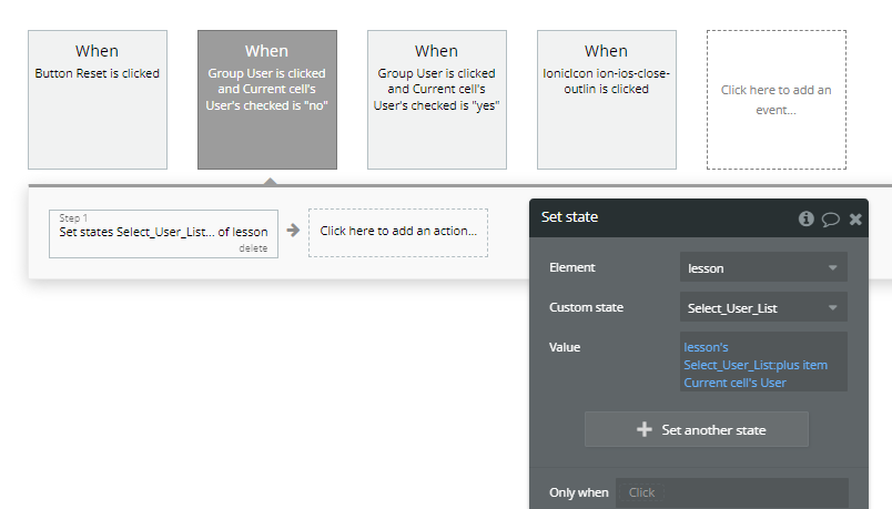
Step1
- Element action -> set state
- Element = lesson
- Custom state = Select_User_List
- Value = lesson's Select_User_List:plus item Current cell's User
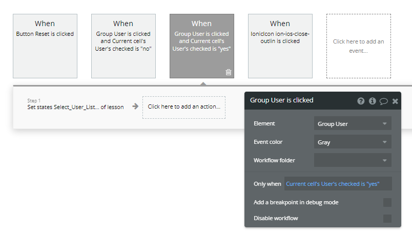
次にチェックされている場合の動作を作ります。
CustomStateのplus itemがminus itemに変わるだけですね。
Group User is clicked
- Element action -> set state
- Element = Group User
- Only when = Current cell's User's checked is "yes"
Step1
- Element action -> set state
- Element = lesson
- Custom state = Select_User_List
- Value = lesson's Select_User_List:minus item Current cell's User
動作確認
ユーザーリストから追加と人数選択から削除が出来るようになったと思います。
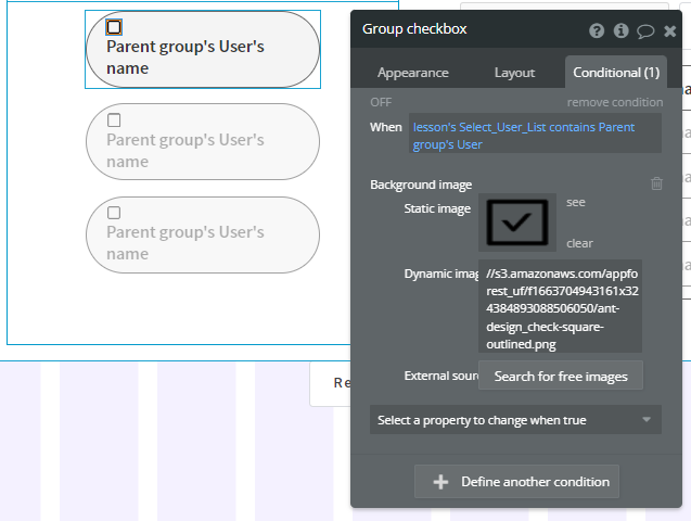
続いて、チェックボックスの状態変化を設定していきます。
Conditional
- When = lesson's Select_User_List contains Parent group's User
- Background image = チェックされている画像
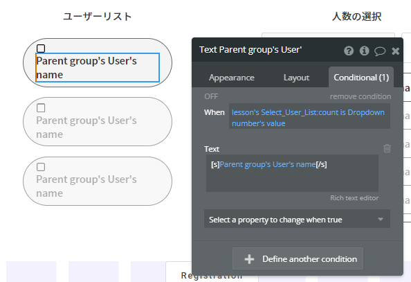
DropDownの人数と同じ数選択したときの処理
UserNameのTextに線を入れる
Conditional
- When = lesson's Select_User_List count is Dropdown number's value
- Text = [s]Parent group's User's name[/s]
ユーザーリストからユーザーをクリックできないようにする
Conditional
- When = lesson's Select_User_List count is Dropdown number's value
- Background color = #D2D2D2
- This element isn't clickable = check
これで、DropDownに選択した人数しか追加できないようになりました。
まとめ
自作セレクトボックス以外にもいろいろと機能を盛り込んだので、少し長くなりましたが、CustomStateを使うことで、やれることの幅が広がるのはわかっていただけたかと思います。
NoCodeStudyという動画プラットフォームで初心者用講座を配信しているので、そちらも確認いただけると幸いです。